
DRAFT — under teacher review.
Mood Boards
The Hamilton and Alexandra College · Year 12 · 2026
A mood board is one of the four ideation tools in your C4-1 design pack. If you've never made one, start here.
What is a mood board?
A mood board is a visual collage that captures the look and feel of your software — before you design any real screens.
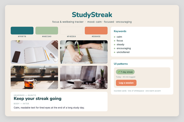
An example board for "StudyStreak" (a focus & wellbeing tracker). Notice how every colour, font and image points at one feeling: calm and focused.
🔗 View it live: open the interactive board in your browser — click Join as a guest for a read-only view (nothing to install).
📂 Want to take it apart? Download the .excalidraw starter, open it in Excalidraw (Obsidian), and see how it's built — then adapt it for your own project.
It gathers the things that set a creative direction:
- Colours — a small palette (3–5 colours)
- Typography — 1–2 fonts you'd use
- Imagery & texture — photos, icons, UI patterns, screenshots of apps that inspire you
- Keywords — a few words for the feeling you want (e.g. calm, playful, trustworthy)
It is not a layout or a wireframe — it doesn't show where buttons go. It answers a different question: "What should this app feel like?"
Why bother?
- It sets the direction early, so your later sketches and detailed designs are consistent instead of random.
- It's a fast way to explore and compare visual ideas before committing.
- It gives you reusable assets — the colours and fonts you choose here carry straight into C5.
Watch and build alongside (10 min)
Don't just watch — build your own board as you go. Copy the designer's thinking, not his tool. Watch for the four boards he creates (you'll make the same four), and notice he starts each by naming the mood — exactly like the StudyStreak example below.
How To Create a Mood Board — Design Process for App UI (NAM Design)
The video builds the board in Miro; you can use Excalidraw, Canva, Obsidian, or even a Google Slide instead — the thinking is the same.
In this class, build your board with Excalidraw in Obsidian. If it isn't installed on your machine, see IT to install the app.
⏸ Pause and build
Pause at each point and do the step for your own project before you resume:
| Pause at | Do this for your project |
|---|---|
| 0:58 | Answer the two prep questions: what app are you making, and on what device? Write them at the top of your canvas. |
| 1:00–4:00 | Skip — this part is just a tour of Miro's buttons. Open Excalidraw in Obsidian instead. |
| 5:00 | Board 1 — Design Style: collect 6–8 inspiration images and write 3–4 mood adjectives. (Gathering more than a couple lets you see the differences and choose deliberately.) |
| 5:58 | Board 2 — Type: pick two fonts that pair (Google Fonts is free). |
| 7:15 | Colour palette: build a primary + secondary + accent palette (coolors.co helps). |
| 8:10 | Board 3 — Imagery: add 3–4 images that fit your feeling (try Unsplash). |
| 9:05 | Board 4 — Interface patterns: find 2–3 real UI examples of parts you'll need (e.g. a card, a button). |
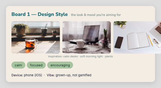
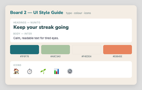
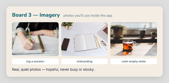
What each board looks like — the StudyStreak example, board by board (the video groups type · colour · icons together as Board 2):

Check Your Understanding
- The designer builds four boards — what are they?
Answer
Design Style · UI Style Guide (type + colour + icons) · Imagery & Graphics · Interface Patterns.
- Why gather 6–8 styles before choosing one?
Answer
So you can see the differences and choose deliberately, instead of locking onto your first idea.
- He insists on finding real examples of interface patterns. Why?
Answer
Real examples are proven — they show patterns that already work, which beats inventing one from scratch.
Worked example — "StudyStreak"
The project: a focus-and-wellbeing tracker that helps VCE students log study sessions and protect their downtime. The audience: stressed senior students. The one feeling: calm, focused, encouraging — not hyped-up or gamified.
Everything on the board ladders up to that one feeling:
| Element | Choice | Why it supports calm & focused |
|---|---|---|
| 🟦 Deep teal | #1F6F78 |
Focus and trust; reads as grown-up, not childish |
| 🟩 Soft sage | #A8C3A0 |
Calm and growth — used to show progress |
| ⬜ Warm sand | #F4EDE4 |
A light background = breathing space, low stress |
| 🟧 Muted coral | #E8845E |
A single warm accent for streak highlights — used sparingly |
| Type — headings | Nunito (rounded sans) | Friendly and approachable, not corporate |
| Type — body | Inter (clean sans) | Easy to read for tired eyes |
| Imagery | tidy desks, morning light, plants, journaling | Quiet, hopeful, real — not stocky or busy |
| UI patterns | rounded cards, lots of whitespace, a growing plant for streaks | Gentle encouragement instead of aggressive scores |
| Keywords | calm · focus · steady · encouraging · uncluttered | The feeling in words |
What we deliberately avoided — and why
This is what lifts a mood board from "nice pictures" to a real design decision:
- ❌ Neon, high-saturation "gamer" colours — senior students read these as childish and over-stimulating.
- ❌ Leaderboards and confetti badges — competition raises stress; StudyStreak is about your own steady progress.
- ❌ Dense, data-heavy dashboards — clutter is the opposite of calm.
The coherence test: pick one feeling, then check every colour, font and image against it. If something doesn't support that feeling, it doesn't belong on the board. A mood board that "feels like five different apps" hasn't done its job.
Your turn
- Open Excalidraw, Canva, or Obsidian.
- Write your project's one feeling at the top (the hardest and most important step).
- Add at least 5 images, 3 colours (with their feeling), and 2 fonts.
- Add a few keywords.
- Check every element against your one feeling — cut anything that doesn't fit.
- Be ready to explain your choices — why this colour, this font, this image. That explanation is exactly what your C4-1 annotations need.
- Credit every asset. Add a small Credits note on your board listing the source, creator and licence of each image, font or icon you didn't make yourself.
Crediting your assets is compulsory. Every image, font or icon you didn't create yourself must be credited — even free ones. Record the title/source, the creator, and the licence (e.g. CC0, Unsplash, SIL OFL). Using an asset without credit is an academic-integrity breach, the same as using someone's words without a reference. See the Credits section at the bottom of this page for the format.
Commit it to GitHub and add it to your printed design pack.
Credits — this page's example board
Crediting assets is compulsory — so here are the credits for the StudyStreak example above. Use this as the format for your own board.
Photos — all CC0 1.0 (public domain), found via Openverse:
- "Laptop Apple" — JESHOOTS.com (StockSnap) — source
- "Writing Hand" — Kristin Hardwick (StockSnap) — source
- "Tea on the countertop" — freestocks.org (Flickr) — source
- "a cup of coffee, a flower and a laptop" — freestocks.org (Flickr) — source
Fonts — SIL Open Font License, via Google Fonts:
See also
- C4-1 Checkpoint — Your Design Pack — where the mood board fits among the four ideation tools
- C4 Design Ideas and Evaluation Explained — the C4 walkthrough videos
← Back to C04 Home · VCE Software Development Hub